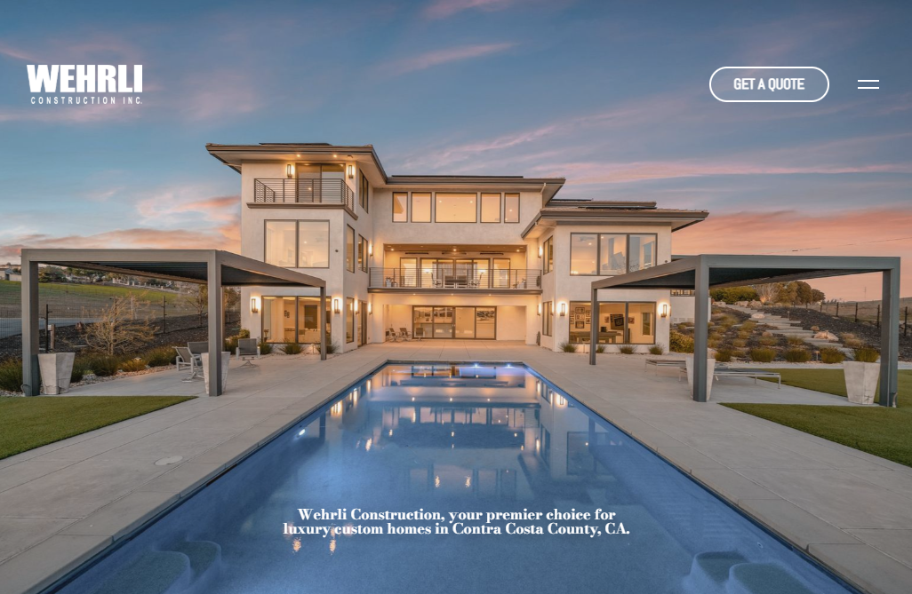
Wehrli Construction, a Danville general contractor and custom home builder, needed a new site to properly present the high-end homes he has been building in upscale communities like Alamo, Clayton, Lafayette and Orinda. Walt Wehrli had built quite a reputation for the quality of his work. But, his old website did not reflect the aspirational presentation styles of the clients with whom he worked. He contacted KO Websites about WordPress website design options.
Danville-Based General Contractor Presents Custom Homes with WordPress Website
KO Websites, a specialist in WordPress CMS website design, created an elegant template into which Wehrli could flow its several custom home design projects. The company offers a range of home types, from Modern Contemporary or Mid-Century Modern to Elegant and Classic Traditional styles. For those seeking something more off-beat, Modern Farm House or Rustic Traditional attracted them.
Whatever the style, workmanship and materials had to be top-notch, and finishes precise.
Where to start? The home page itself. There, we created an image slider that allowed a series of projects to be presented in miniature, enticing the viewer to explore further.
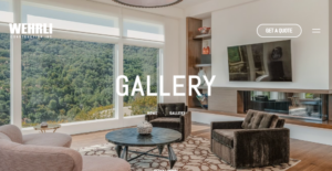
Next the site frame put a gallery of projects as its core feature. Two sections allowed easy browsing for site visitors:
- A Featured Projects section, which presented a selection of recent work and more popular styles.
- Next, a more in-depth Finished Projects section where the viewers will find a comprehensive library of all the great work Wehrli has done from Sunol to Pleasanton, up along the 680 corridor through Danville and Alamo to Lamorinda and the hills around Walnut Creek.
KO WordPress Design Presents Easy-to-Browse Image Portfolios
The most important aspect of the site design focused on the browser’s experiences (website UX.)
Click on a portfolio, and a new matrix opened of all the images within one project.
Click on any image, and a new slider popped up allowing a scroll through the project with large, sharp images that presented each project in its best light.
Finally, the contact form, which is the ultimate destination for a prospective client, easy to find in the navigation and easy to complete. The website is designed to get a viewer entranced, and a conversation started!
Work with the Best Bay Area Website Design Team – KO Websites
For over 20 years, KO Websites has been serving the needs of Bay Area businesses looking to present themselves effectively online and generate strong lead flow (for B2B) and transactions (for B2C). Having created, optimized and launched hundreds of sites, we have seen and done it all!
Work with the best Bay Area website design team and SEO Pros. Contact us today to start that conversation!


