Professional B2C Website Design That Turns Browsers Into Loyal Customers
Custom websites for Bay Area consumer brands that capture attention in seconds, make buying effortless, and turn first-time visitors into repeat customers
Best B2C Websites: Bay Area Examples That Turn Browsers Into Loyal Customers
B2C websites operate under a conversion constraint that B2B sites rarely face: the buyer is the user, the decision is often emotional, and there is no procurement process to slow things down. A consumer can discover a brand, judge it, and buy – or leave for good – in a single mobile session. The best B2C websites in the Bay Area win that moment by communicating personality and trust quickly, removing every unnecessary step between interest and purchase, and giving shoppers the information they need to feel confident. The California brands below show how this works across fashion, footwear, food, and household products, four categories where consumers choose based on identity, convenience, and values. Each example highlights design and conversion choices that KO Websites can bring to your own brand.
Allbirds
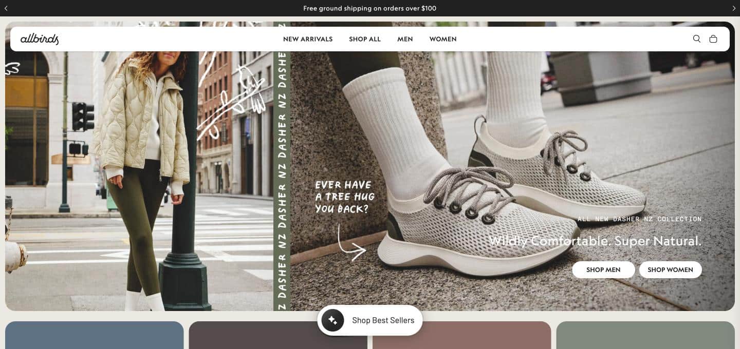
Allbirds — the San Francisco footwear and apparel brand that launched in 2016 with a single product, the Wool Runner — has built a direct-to-consumer website around the idea that comfort and sustainability do not have to compete. The brand’s material story is part of the shopping experience rather than a separate page: merino wool, eucalyptus-based fibers, and sugarcane-derived foam are named, explained, and tied to specific product lines, so a shopper understands why a shoe is different before comparing prices. The restrained, minimal design mirrors the product philosophy, with no flashy logos and no visual clutter, which signals quality through simplicity. Certified B Corp status and the ReRun resale program give environmentally minded buyers concrete proof points instead of vague green claims. The result is a website where brand values and product pages reinforce each other, a model for any consumer brand that needs to justify a premium price with a clear, credible story.
Everlane
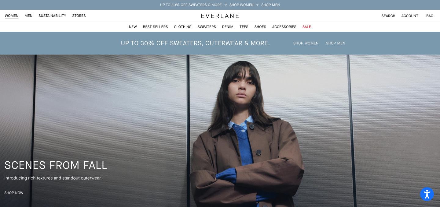
Everlane — the San Francisco fashion brand built on the principle of radical transparency — uses its website to answer the question every apparel shopper silently asks: why does this cost what it costs? Product pages that explain materials, factories, and pricing logic turn a standard e-commerce listing into a trust-building document, and that transparency becomes the brand’s most defensible differentiator in a crowded fashion market. The visual design is deliberately quiet, with generous white space, clean product photography, and simple navigation that keeps attention on the garments. Category structure is intuitive enough that a first-time visitor can find essentials in a couple of clicks, which is critical for a brand that sells everyday basics rather than occasion pieces. For Bay Area consumer brands competing on values and honesty, Everlane shows that a website can sell a philosophy and a product at the same time.
Rothy’s
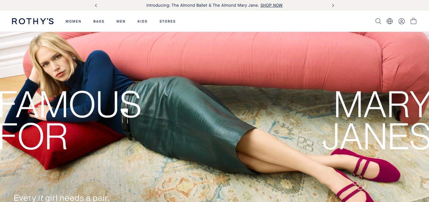
Rothy’s — the San Francisco footwear and accessories brand known for flats made from recycled materials — has built a website around a product story that fits in a single sentence: stylish, washable shoes with a sustainability angle. That clarity is a major conversion asset, because a shopper landing on the homepage understands within seconds what makes the product different from every other flat on the market. The knitted construction and machine-washable promise turn a practical benefit into a brand signature, and the website supports it with clear product photography, color and style selection, and sizing guidance that reduces the uncertainty of buying shoes online. The same recognizable design language carries across shoes, bags, and accessories, which helps the brand cross-sell without confusing the shopper. For direct-to-consumer brands with a distinctive material or manufacturing story, Rothy’s demonstrates how to make the product itself the headline.
ThirdLove
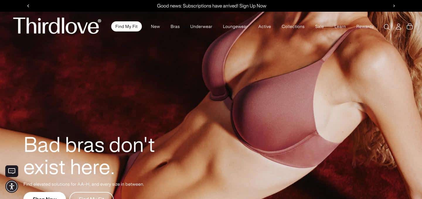
ThirdLove — the San Francisco intimates brand known for its half-cup sizing and its fit-focused approach — shows how a website can solve the most frustrating problem in a product category. Bra shopping online is difficult because fit is personal and returns are costly, so ThirdLove built its experience around helping shoppers find the right size, led by a fit-finder quiz that turns uncertainty into a guided path to purchase. That quiz does double duty: it reduces returns for the business and gives the customer confidence to buy something they cannot try on first. The messaging centers on inclusive sizing and comfort, speaking directly to the audience that felt underserved by traditional lingerie marketing. Product pages stay focused on fit, fabric, and styles rather than on distraction. For any brand that sells products where size and fit create hesitation, ThirdLove is a clear example of using interactive tools as a conversion engine.
Betabrand
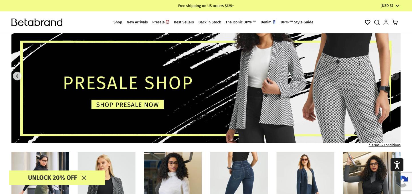
Betabrand — the San Francisco apparel brand best known for comfort-first workwear such as its Dress Pant Yoga Pants — builds its identity on a playful, community-driven approach to fashion. The brand became known for letting its audience influence what gets made, and the website carries that spirit through bold imagery, humor, and a clear point of view that makes the brand memorable in a category where most competitors blend together. Strong brand personality is a conversion tool: shoppers who connect with the voice are more likely to remember the brand, return to the site, and share it. The product range is organized around specific use cases such as work, travel, and everyday wear, helping shoppers find what they need without browsing an overwhelming catalog. For Bay Area brands that want to stand out through character rather than price, Betabrand shows how personality and product can reinforce each other.
Philz Coffee
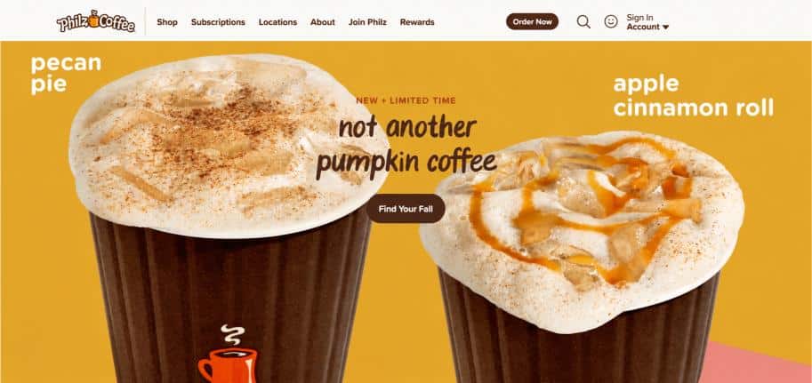
Philz Coffee — the specialty coffee brand that began in San Francisco’s Mission District in 2003 and grew into a Bay Area institution — extends its cafe identity into a website that serves two audiences at once: people looking for the nearest location and people ready to buy beans at home. The brand’s signature is a custom, one-cup-at-a-time approach to coffee, and the website supports that story through approachable blend descriptions that help shoppers choose without needing expert vocabulary. Well-known menu favorites double as marketing assets, giving first-time visitors a recognizable starting point. A location finder with local details serves cafe traffic, while online coffee ordering serves customers who want the experience at home, and the two paths are clear enough that neither interferes with the other. For businesses with physical locations and an online store, Philz is a model of integrating both under one coherent brand.
Dolls Kill
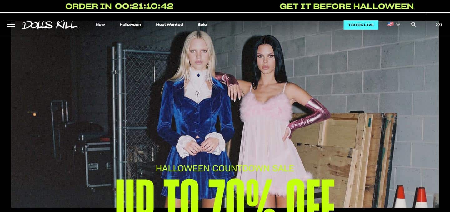
Dolls Kill — the San Francisco alternative fashion brand — demonstrates how a strongly defined subculture can power an entire e-commerce experience. The brand speaks to specific style communities, such as punk, festival, goth, and rave fashion, and the website is organized around those identities so that shoppers browse by attitude as much as by product category. Bold, high-energy visuals and a distinctive voice create an immediate sense of belonging, which is far more powerful than a generic apparel layout. Frequent new arrivals and promotional messaging keep the experience dynamic, rewarding repeat visits in a way that suits trend-driven shoppers. The site also serves a mobile-first audience that discovers brands through social media, which makes fast loading and thumb-friendly navigation essential. For consumer brands built around identity and community, Dolls Kill is a case study in letting the audience see themselves in the website.
Good Eggs
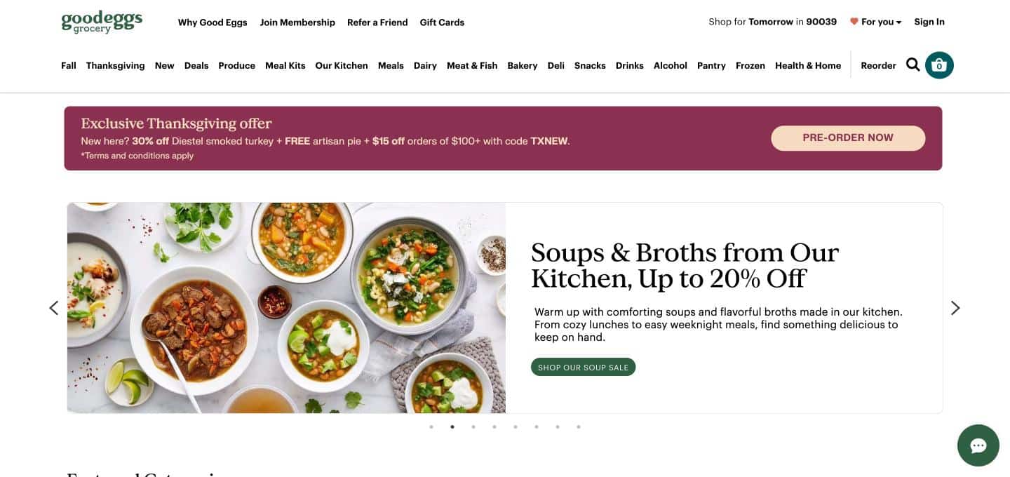
Good Eggs — the Bay Area online grocery that connects shoppers with local food producers — solves a challenge unique to regional commerce: showing visitors what is actually available to them. Because inventory and delivery depend on location, the experience begins with the shopper’s area, then opens into a catalog of local farms, bakers, and food makers that feel more personal than a national grocery chain. Storytelling about producers is built into the shopping experience, giving customers a reason to pay for quality and local sourcing. Meal kits and ready-to-cook options address the everyday question of what to make for dinner, converting browsing into larger baskets. Clear delivery information and an ordering flow designed for repeat purchases support the habit-forming behavior grocery depends on. For regional brands that compete on freshness and community connection, Good Eggs shows how local identity can become the core of the website.
Grove Collaborative
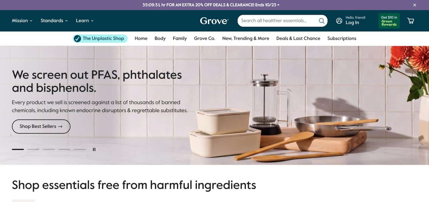
Grove Collaborative — the San Francisco company that sells sustainable cleaning, personal care, and household products — has designed its website around the idea that switching to better everyday products should feel easy. Product discovery is organized by household need, such as cleaning, laundry, and personal care, so shoppers can replace what they already buy instead of learning an entirely new category. Clear sustainability messaging explains why the products are different without lecturing, and curated starter sets and bundles lower the barrier for first-time buyers. Replenishment-friendly shopping suits household goods, which customers use up and reorder, making repeat purchase behavior central to the experience. Clean layouts, readable product pages, and consistent branding give the site a modern, trustworthy look that fits its values-driven audience. For brands selling everyday consumables, Grove is a strong example of designing for the long-term relationship rather than a single order.
Clif Bar
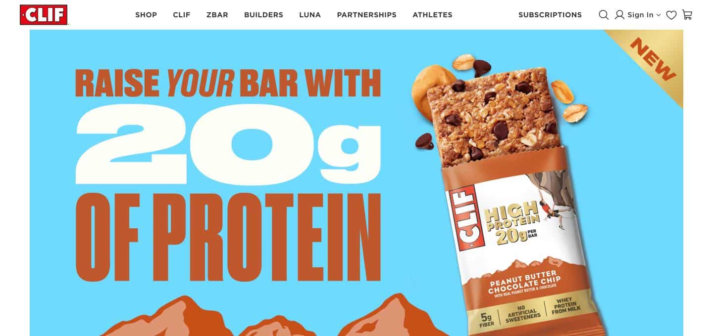
Clif Bar — the Emeryville-based energy food company founded in 1992 — operates a website that has to serve a different job than most direct-to-consumer brands: strengthen a product that people mostly buy at retail while giving fans a deeper brand experience online. The site organizes the range by product type and flavor, helping visitors compare options quickly, and a where-to-buy path connects interest to the shelf or the online cart. Brand storytelling about the company’s roots, values, and sustainability commitments gives the site an identity beyond snacks, which supports loyalty in a competitive category. Active-lifestyle imagery speaks directly to the athletes, hikers, and cyclists who form the core audience. For established consumer brands with wide retail distribution, Clif Bar illustrates how a website can drive both discovery and purchase without needing to be a pure online store.
From a San Francisco footwear brand that makes materials the headline, to a fashion label built on pricing transparency, to a Bay Area grocery that puts local producers first — every B2C website above converts because it understands why consumers buy: they want to feel confident, understood, and one step away from getting what they came for. If your consumer brand is based in San Francisco, Oakland, the Peninsula, the South Bay, or anywhere across the Bay Area, KO Websites builds B2C websites with the same clarity, speed, and brand-first design, plus the local search structure that turns visitors into customers. Contact us today for a free consultation.
What Sets Our B2C Website Design Apart
Conversion-First Consumer Experience
We design every page around the path to action. Clear value propositions, uncluttered navigation, and prominent calls to action reduce the number of decisions a visitor has to make, so more visitors buy, book, or sign up. Our web design approach treats each page as a step toward a customer, not a brochure.
Mobile-First by Default
Most consumer traffic arrives on a phone, so we design for the smallest screen first and scale up. Thumb-friendly buttons, fast load times, and simplified forms come standard through our responsive web design process, with additional options through mobile web design and marketing.
Brand Personality That Builds Trust
Consumers choose brands they feel connected to. We translate your story, personality, and values into copy, photography, and layout that feel authentic, with video production available when motion shows your products and story better than a paragraph.
Proven Bay Area Success
Our client testimonials reflect years of building websites for Bay Area businesses that depend on local customers. We pair design with SEO strategy so the site is built to be found, not just admired.
Advanced Features for B2C Website Success
Streamlined Checkout
Short checkout flows, guest purchasing, multiple payment options, and clear shipping information reduce abandoned carts. We set up shopping carts and merchant accounts so buying works smoothly on a phone.
Subscriptions, Bundles, and Loyalty
Replenishment options, starter sets, bundles, and gift cards are presented with transparent pricing, giving first-time buyers a low-risk way to start and repeat customers an easy way to reorder.
Local and Multi-Location Pages
Store locators, individual location pages, and neighborhood-specific content help brands with physical locations rank locally and route visitors to the right place. This structure supports local search optimization for each location.
Reviews, Social Proof, and Reputation
Star ratings, testimonials, awards, and press mentions are placed where doubt is highest – near pricing and buy buttons – and supported by managed hosting and website management that keeps the site fast and secure.
Complete B2C Digital Solutions
Direct-to-Consumer Brand Sites
Websites that tell your brand story and sell directly, without relying on marketplaces. Strong visual identity, product storytelling, and email capture build a customer base you own, with online store setup included.
Fashion, Apparel, and Lifestyle Brands
Clean product pages, sizing guidance, and style-led navigation that help shoppers find what they want and buy with confidence, on any screen size.
Food, Beverage, and Grocery
Menus, product catalogs, delivery information, and ordering flows for brands that sell what people eat and drink. For restaurants specifically, see our restaurant website design.
Hospitality and Event Sites
Reservations, galleries, and event details presented for curious, time-pressed visitors. Explore our hospitality website design and event website design.
Local Consumer Services
Practices and service companies need trust, credentials, and easy scheduling. See our work for dental practices, medical practices, and home service companies.
Custom Tools and Budget-Friendly Launches
Interactive tools, member portals, and custom features through custom app development and AI web design, plus our low-cost web design and small business website design options for new brands that need a strong, scalable start.
View our complete website portfolio to see these strategies in action.
Serving Bay Area Consumer Brands
From San Francisco and Oakland to San Jose and Silicon Valley, we understand the expectations of Bay Area consumers. Our East Bay reach includes Berkeley, Alameda, Hayward, Fremont, Union City, San Leandro, Castro Valley, Pleasanton, Livermore, and San Ramon. In the North Bay, we also serve Marin County and Sonoma County. See our complete service areas.
Comprehensive Digital Growth Solutions
A great website needs traffic. Our SEO services and local search optimization help consumers find you when they search for what you sell. Targeted PPC management captures people ready to buy, while social media marketing – including San Francisco social media marketing – builds the awareness and community consumer brands depend on. Professional content writing and blogs support organic growth, and our website management keeps your site fast, secure, and up to date.
B2C Website Design Questions Answered
How is B2C website design different from B2B website design?
B2C sites speak to individual consumers who decide quickly and often emotionally, so they prioritize instant clarity, visual identity, mobile usability, and a short path to purchase. B2B websites typically serve longer, committee-driven decisions and emphasize detailed information, case studies, and lead capture. We design each for the way its buyer actually behaves.
How do you design B2C websites for mobile users?
We start with the mobile layout and build up. That means fast loading pages, large tap targets, simple navigation, short forms, and checkout flows that work smoothly on a phone. We test on real devices because a design that looks good on a desktop can fail on a small screen.
Can you integrate online payments, subscriptions, and booking tools?
Yes. We connect your website to the payment, subscription, and scheduling tools your business uses, or help you choose the right ones. We also set up shopping carts and merchant accounts for brands that sell online.
How do you build trust with first-time visitors?
Trust comes from visible, specific proof: genuine reviews, clear pricing, real photography, credentials, and easy ways to contact you. We place these elements near key decision points. Following Google’s guidance on helpful, people-first content also strengthens credibility and search visibility.
How long does it take to build a B2C website?
Most consumer websites take roughly 6 to 10 weeks, depending on the number of products, locations, integrations, and content readiness. Larger catalogs, subscriptions, or custom tools can extend the timeline. We outline a clear schedule during the strategy call.
How do you measure the success of a B2C website?
We track conversion rate, average order value, cart abandonment, traffic sources, repeat purchases, and local search visibility. These numbers show what is working and where to improve. Our client success stories reflect this ongoing, data-informed approach.
Launch a Website Your Customers Love to Buy From
Every day your website is slow, confusing, or forgettable, shoppers are choosing someone else. Your brand deserves a site that earns attention in seconds, builds trust at every step, and makes buying feel effortless. Our proven approach combines consumer-focused design, search-ready structure, and Bay Area market knowledge to drive consistent, measurable growth.